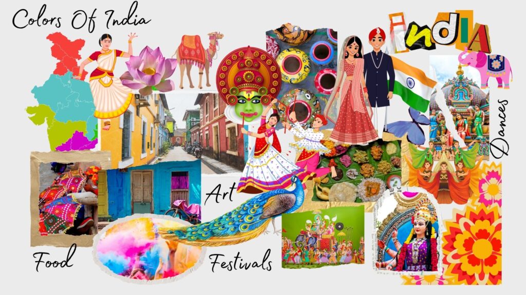
India is a country of color. Its abundant festivals & diverse cultures let us understand color theory, helping colors tell stories poetically. Colors create an aura / a vibe, and it becomes a symbol of identity in India. They are a medium of expressing oneself, traditions, and status.
Every color carries a unique significance, cultural connotations & emotional resonance. From whites that depict luxury as well as grief to reds that depict love as well as hatred/anger/something evil.
Indian festivals are drenched in Hues & patterns. From celebrating Holi, the festival of all the colors, to celebrating each day by associating it with its respective occasion/day. In Indian culture, every color is not just associated with emotion/mood but also with deities. Like whites and blues are associated with Lord Shiva and Moon God, and red with Goddess Durga.
By understanding Color Theory, we build a bridge that connects our traditions with modern fashion trends in the ever-changing fashion industry. Designers & Fashion Enthusiasts recite stories & poems through their designs & creations, and these colors bring these creations to life, giving them a deeper meaning.

What is Color Theory?
The practical amalgam of art & science, which helps in creating designs with perfect color fusions that look good together, is known as Color Theory. Colors influence 85% of shoppers’ purchase decisions & have the potential to increase brand awareness by 80%.
The step-by-step process of mixing, combining & manipulating colors is referred to as COLOR THEORY. Pointers that need to be taken care of while following the process of color theory.
Color Harmony
Harmony in itself means soothing/pleasing. Colors that look pleasing together aesthetically create a sense of balance & visual appeal.
To achieve color harmony, one must understand:
- Color Relationships.
- Context of using the particular colors.
- How to balance the contrasting colors.
Color Temperature
All colors have their own temperature, either warm or cool, and this goes for human skin tone also. This further affects the look of different colors on us.
The color wheel has balanced combinations of warm & cool colors; different color temperatures bring forth different feelings.
Warm colors include red, oranges & yellows along with their combinations, for stimulating activity. Hence, they are associated with gyms & restaurants.
Cool colors include blues, purples & greens along with their combinations for stimulating a refreshing vibe. Hence, these are helpful in relaxing spaces like bedrooms & spas.
Color Context
A lot depends on when & where the colors will be used, one cannot use combinations of pastels to make a bright & vibrant creative & similarly, we cannot use dark & dull colors to make something soothing.
Colors & Its Variants

Colors
It is a perception of light reflecting from an object with different wavelengths and energies. It is mainly related to how much light an object can absorb or reflect back. Colors are divided into the following categories:
Primary Colors
Red, Yellow & Blue
These colors combine to make a range of other colors. They are spaced evenly apart from each other in the color wheel. On mixing them, many other colors are formed.
Secondary Colors
The colors that are formed by mixing 2 primary colors
- Yellow + Blue = Green
- Red + Yellow = Orange
- Red + Blue = Purple
- Blue + Green = Teal
- Blue + Purple = Violet
Tertiary Colors
These colors are formed by mixing Primary & Secondary colors.
- Red + Purple = Magenta
- Red + Orange = Vermilion
- Yellow + Orange = Amber
- Yellow + Green = Chartreuse
- Blue + Green = Teal
- Blue + Purple = Violet
Hues
It is the original/pure form of color. All primary, secondary & tertiary colors are referred to as hues. To get a desired shade, tint, or tone of any color, hues are mixed with black, white, or gray.
One derives various shades, tints, and tones from the 12 basic hues present in the color
Shades
When we mix black color one by one after getting a new color every time, a new shade is achieved, hence getting multiple shades of the same hue. When a color moves towards its darker side, it is called a shade of the color.
For example, Red + Black = Burgundy

Tints
When we mix white color one by one after getting a new color every time, a new tint is achieved, hence getting multiple tints of the same hue. When a color moves towards its lighter side, it is called a tint of the color.
For example, Red + White = Pink

Tones
When we mix gray color one by one after getting a new color every time, a new tone is achieved, hence getting multiple tones of the same hue. Here we manipulate the intensity of the hue and get a dull version of it.
When colors are too bright for printing, the gray color is added to tone down the image, enhancing the visual appeal.

Knowing the Color Theory Wheel and its importance in the fashion industry
The color wheel is the basis of Color Theory. It is a circular, illustrative diagram that helps to understand color hues, with each hue falling into different categories: primary, secondary, and tertiary.
The color wheel was invented in 1666 by Issac Newton, who mapped the color spectrum into a circle.
To apply the color theory with different elements & principles of design, one must know the relationship between different colors.
Colors and their relationship with each other and their Color Wheel
Complimentary Colors
These are the colors that are placed opposite each other on the color wheel. They are contrasting to each other, but when paired together, their impact is brighter and has a high impact look, especially in film, fashion, photography, and other forms of art.
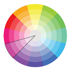
Monochromatic Colors
When we use different shades, tones & tints of one hue or a base color. It gives a very subtle & harmonious look to the design project. It is the safest color combination for designing any project.
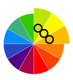
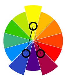
Analogous Colors
This combination uses 3 adjacent colors in the color wheel. It includes one primary color and 2 colors on either side of it. This combination is made from the same hue. Here, the primary color dominates, and the other 2 colors support the primary color.
Triadic Colors
Colors that are evenly placed/spaced in a triangular shape in a color wheel. These colors are bolder and more vibrant than the analogous combination. They are contrasting and belong to different hues. They create dynamic, eye-catching designs.
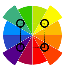
Tetradic Colors
This combination has 4 colors spaced in a rectangular shape in a color wheel; in other words, it includes 2 pairs of complementary colors. Since 4 colors become difficult to handle, one color is chosen as a dominant one and the other colors support that one color, i.e., they become accents. It helps in maintaining the design harmony without making it look odd or unusual.
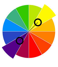
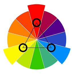
Split-Complementary Colors
It is where a design is created not with 2 contrasting colors but with 3 different hues, creating soft contrast designs. Here, one shade from the color wheel is selected along with the 2 colors adjacent to that color’s complement.. Here, the one shade chosen is the dominant color, and the other 2 act as accents.
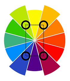
Square Colors
This scheme also has 4 colors that are spaced/placed at equal distances from one another. This scheme is better balanced, dynamic & bolder than the Tetradic Scheme. It gives a higher contrast look than Tetradic.
Fashion is not just about getting a garment made; it is about building a masterpiece, a piece that tells a story to thousands of people. Curating something that helps people express themselves. And all of that can be done only when we choose the right colors. Colors not only enhance the look of the garment but also help a person to express their feelings, mood, culture, and stories.
It doesn’t matter if you are a designer, stylist, or just someone who loves dressing up; if you understand the color wheel theory, then there is no end to your creations.
So, stay tuned to learn more about colors, how they affect our mood and feelings, which colors are preferred for various occasions, how we can dress better by understanding color theory based on our skin tone, and many more…!
Home